While looking around at the stationery market today, one can’t help but be impressed with the beautiful prints, designs and breathtaking art created with heartfelt connotations for celebrations spanning a wide variety of occasions.
With Mother’s Day right around the corner, and the ongoing situation encouraging a distant celebration this year, there is no better way to tell Mom that you’re thinking of her than with a beautiful Mother’s Day card.
But among the diversity of designs comes one underlying flaw. A vast similarity spanning the spectrum of stationery from one shelf to the next. Minimally varying tones of white, flat, 100 pound cardstock displaying undeniably breathtaking prints.
Similarity in the Marketplace
With cards intending to reach a level of sentiment and personal connection, there seems to be a trend towards only being able to go as far as the availability in diverse cardstock material allows, or lack thereof.
When customers pick up their cards for the first time and admire the beauty of brilliant designs and words speaking to the personal nature of the memento, they are left feeling the impersonal similarity from one piece of paper to the other.
Cards are meant to make a lasting impact on the lives of their recipients, and act as a personal touch for a number of different occasions. That one similarity seems to be standing in the way of a card making a truly personal impact.
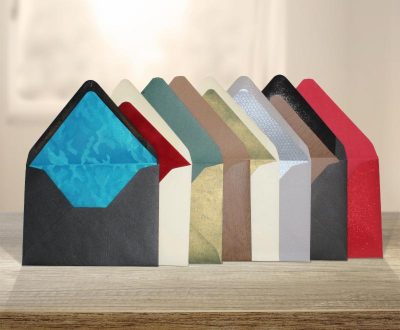
Plain, white, smooth paper dominates the stationery world as it consistently results in easy-to-print material. In a world where social distancing is the norm, the lack of a unique touch that is found in plain, white cardstock seems to be more prominent than ever.
What Are We Missing?
Cards are meant to be held, touched, admired… to limit that sense of touch through the use of abundantly similar stationery stock is to limit the personal sentiment that comes with buying a card for a loved one, friend, or colleague.
Beautifully designed cards are painted and printed with magnificent art that draw the sense of sight. Truly unique and personalized cards may ignite the sense of smell… But why is it that there appears to be a trend towards denying the most obvious sense accompanying the personalized gift of a meaningful card? What is it that separates the sentiment of a physical card representing more than a simple email? The answer is the sense of touch.
The Solution
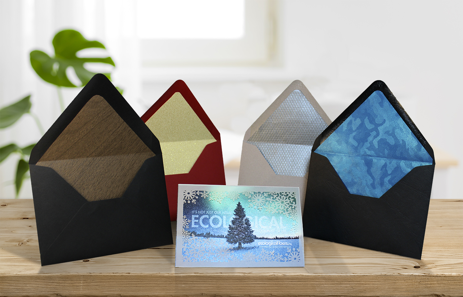
There is a solution. On the market today is a printable, textured paper designed specifically to add that extra touch to the stationery industry, paired with the ease of printing that designers and printers have grown accustomed to.
In a time of social distancing where a card might be the most personal form of communication available, be sure that yours provides the missing element of a unique touch to really drive home the sentiment behind the note.
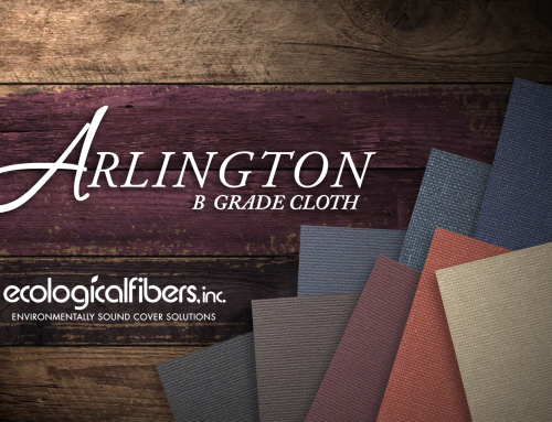
With over 100 embossings available in more than 80 colors, Ecological Fibers’ Rainbow® coated and uncoated papers help designers add that much needed personal note to the cards that mean the most through these trying times.
The embossed texture paired with incomparable printability and stampability that Ecological Fibers provides through a material that is always FSC Certified, as well as being acid-free, lignin-free and archival, allow Rainbow® papers to add a new level of personalization to the stationery industry. For more information on our green initiatives, please click here.
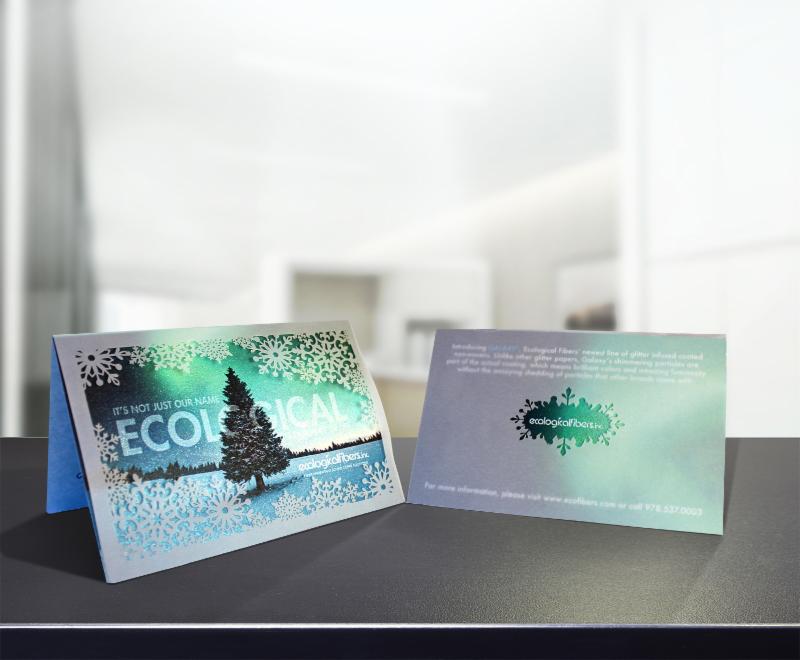
And for more information on how Ecological Fibers can help you add that personal touch to your work, contact Jeremy Quill at jeremyq@ecofibers.com.


